Choosing a gardening colour palette

Blog
The Boodles Best of British Garden choosing the colour palette
I love the vibrancy and drama in Pre-Raphaelite paintings and I want to harness this vibrancy of colour in my plant palette for the garden design of The Boodles Best of British Garden at RHS Chelsea this year.
It’s as though they have captured the very essence of Mother Nature and amplified it tenfold. The larkspur in Dante’s La Ghirlandata isn’t just blue, it’s an almost glowing Prussian blue and the roses, a crimson pink. And I want to harness this vibrancy in my plant colour palette for Chelsea this year.
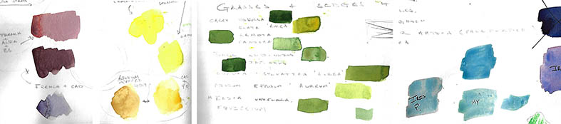
Like all my garden design projects, I begin by establishing some pleasing colour combinations using watercolours. I knew I wanted to use pink as that is the colour of Boodles, my sponsor. If one was to translate their pink as a kind of base and mixing it with different colours, you can find some great combinations. So, here I tried it with my favourite blue: French Ultramarine. Mixed in with some alizarin crimson, I got some lovely claret reds. Further mixed with the complimentary cadmium yellow, brought out a great purple hue. From these combinations, I began to look at plants that can represent these colours. Hence my choice of claret-y purple-y Aquilegia atrata and cadmium yellow/yellow orange Lilium martagon ‘Peppard’s Gold’ in the garden design.
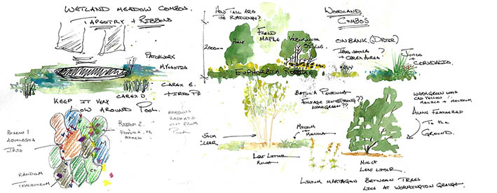
Once I have my main features in place, I work on my fillers that will show these off to their best using the same process. As my scheme is naturalistic, it will feature a lot of grasses and their kin. I think that the golden and sulphur yellows found in many species will highlight my French ultramarine-based pinks, blues and purples well and plan on large drifts of not only grasses but also lime green Euphorbia robbiae and Chiastophyllum oppositifolium too.
And so, I will keep fiddling with this until I feel it is right, before looking at texture and habit. But here we are, with the beginnings of a vibrant palette for the garden design, inspired by the Pre-Raphaelites for The Boodles ” Best of British Garden” at RHS Chelsea 2023